
AES' visual identity guidelines
Typography
Unique typography is one of the hardest working tools in our toolkit. It ensures that even when there is no color or photography present, our content still stands out from competitors and looks like us.
Our type is effortlessly confident in headlines and easy to read in body copy. It is the visual manifestation of the AES voice—leading, yet humble.
AES' primary typeface

Type weight distribution
Typography is used to differentiate information, create hierarchy, and build visual cohesion. At the crux of the AES typographic system is the idea of tone.
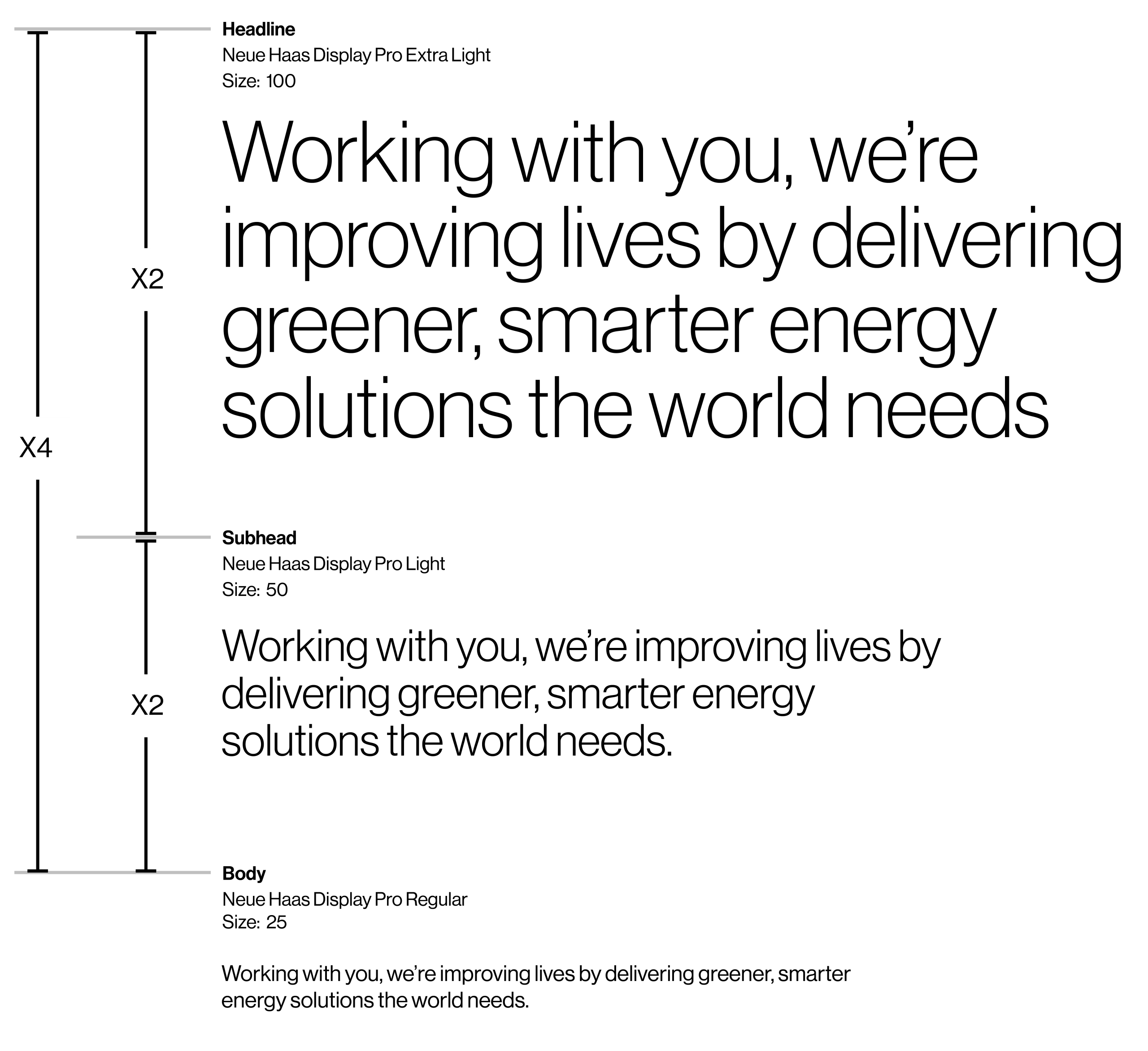
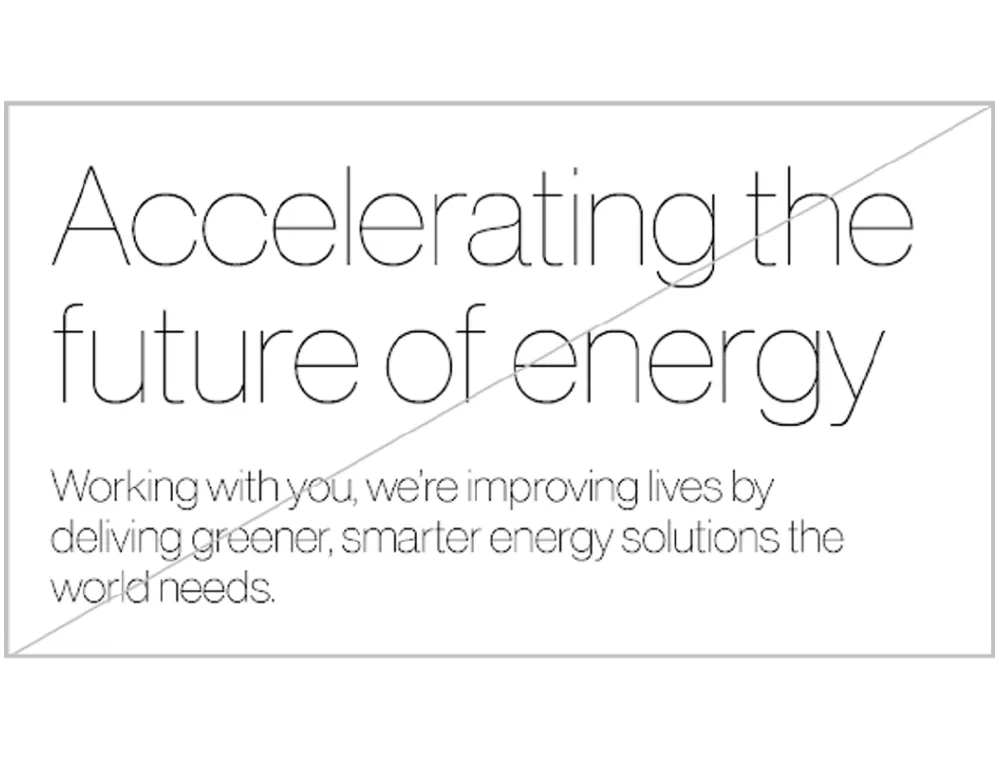
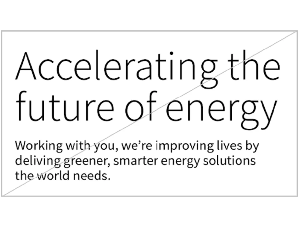
Correct type weights
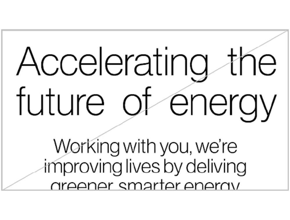
The AES brand is light and effortless.
To achieve this effect, type weight decreases as the point size increases. This creates an even text tone throughout the page.

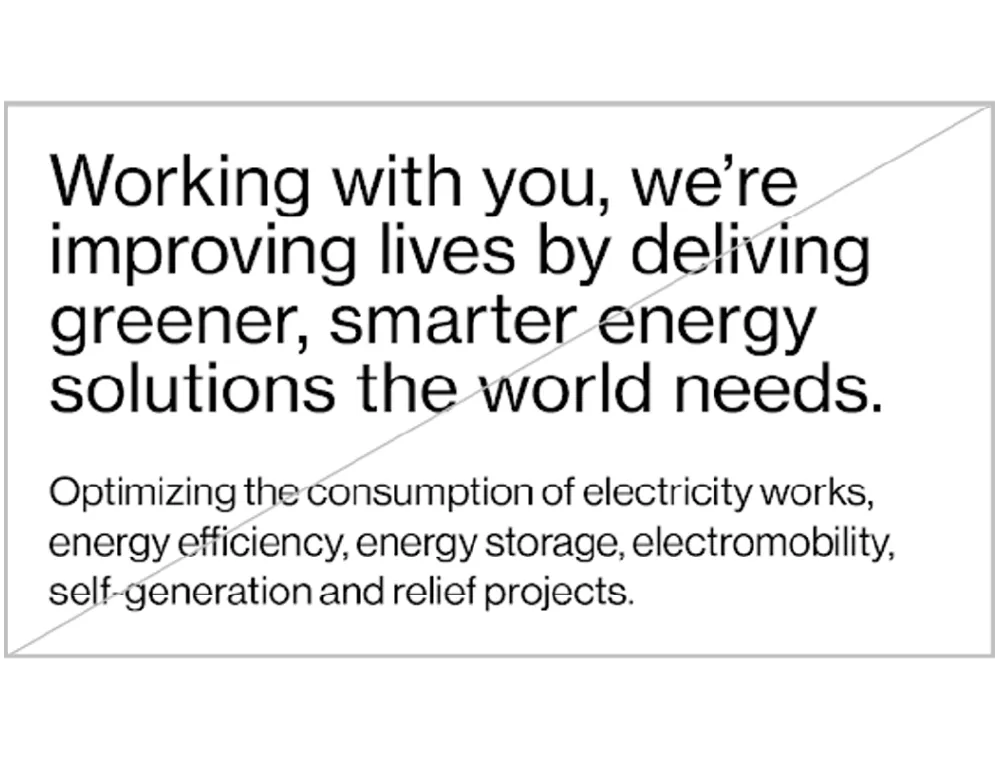
Incorrect type weights
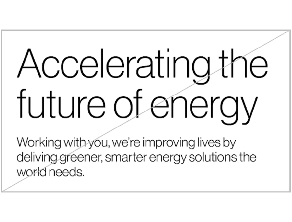
When the same weights are used at different point sizes, the typography no longer appears light and effortless.

Calculating point sizes
Stroke weight should be matched across point sizes using different weights within the Neue Haas Display and Text family.
A quick equation to aid this matching, is to take the measurement of one point size measurement (of either headlines or body) and multiply or divide it by 2 to calculate the point size of the weight above or below.
If using only one headline, we recommend using Neue Haas Display Extra Light.
If using only one headline and body copy, multiply or divide the point size by 4.
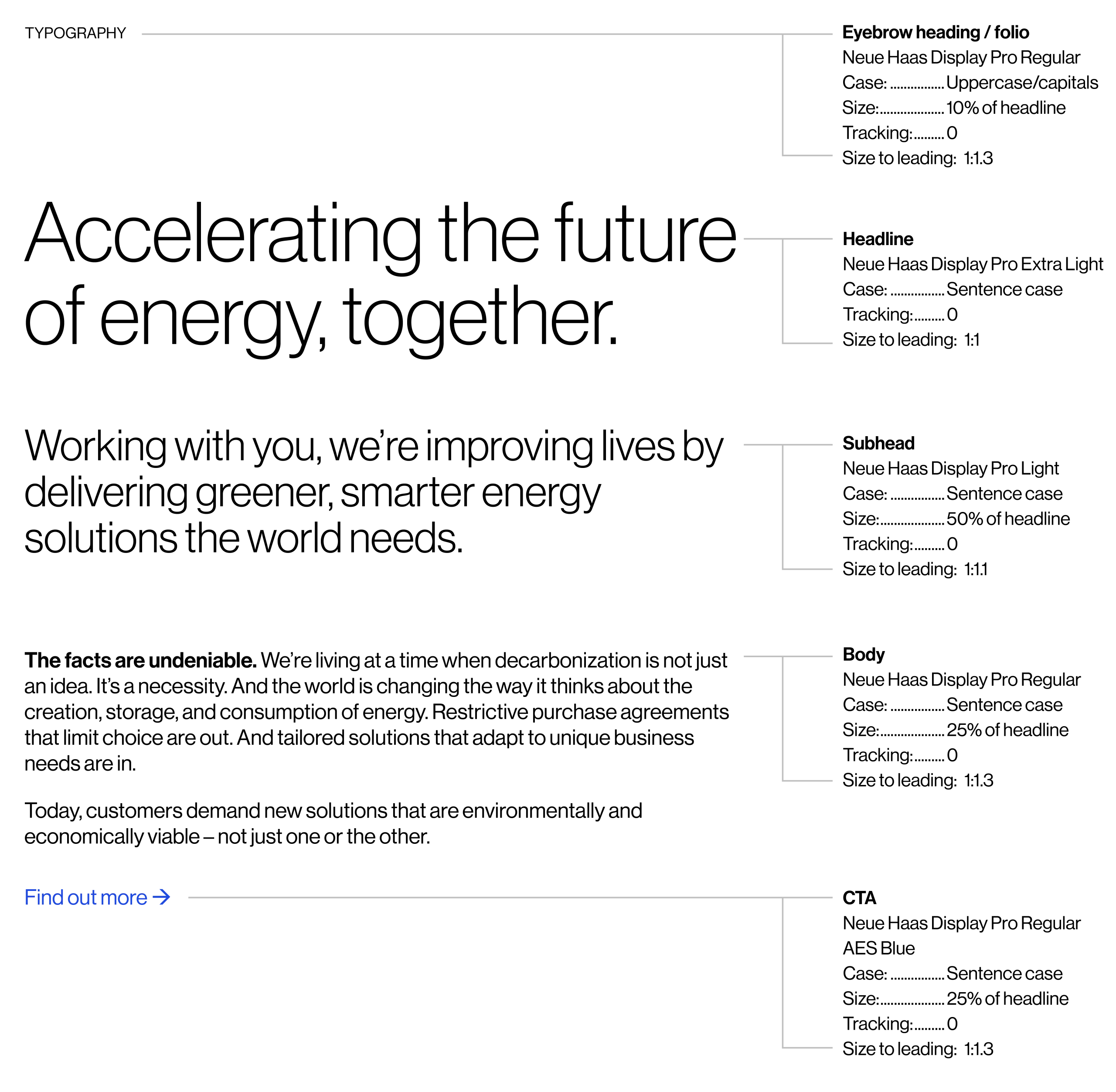
Type hierarchy
This outlines the basic relationships between typefaces and the levels of information that will be needed in the brand.
Body copy is always set in Neue Haas Text Regular with active call-outs in Bold. Headlines are always set in Neue Haas Display Light or Extra Light.
Text is always left aligned.
When writing ‘AES’ in copy, always use capital letters, with no spaces. The smallest recommended text size is 6pt.
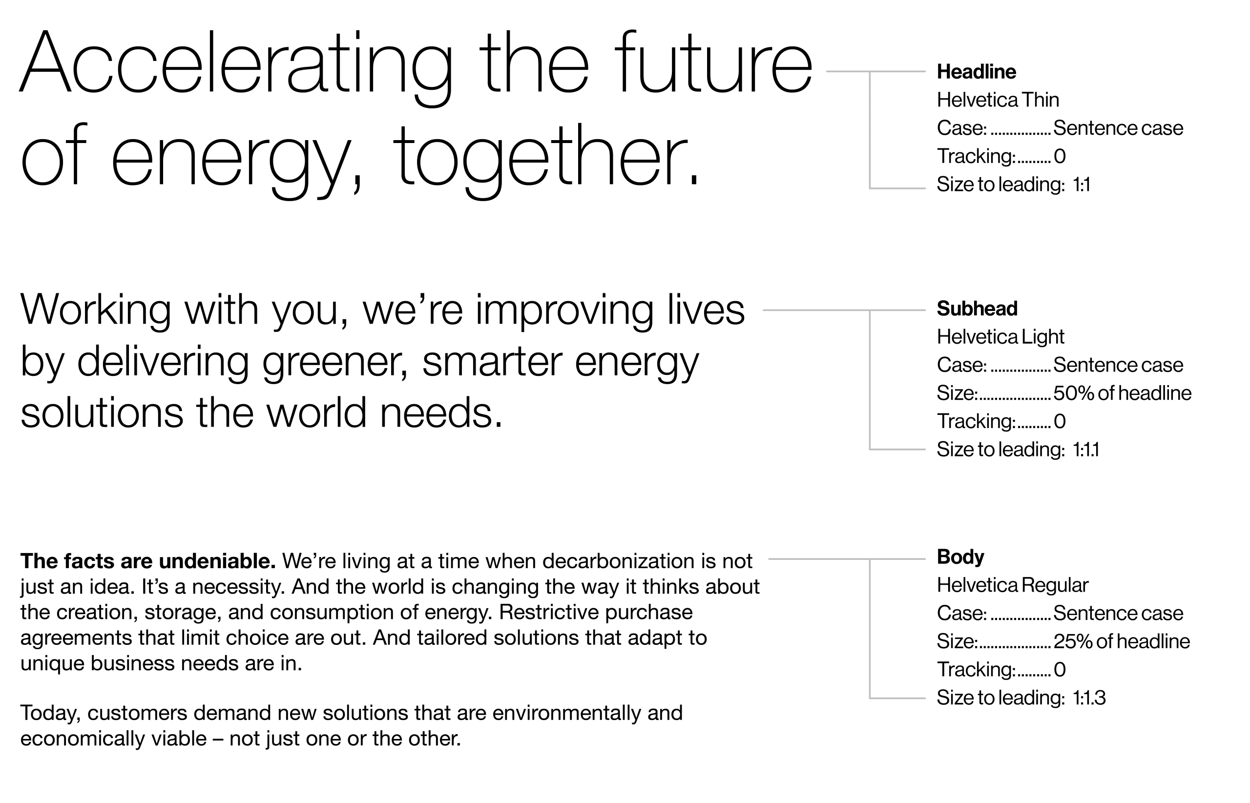
System typefaces
Helvetica
For digital platforms where the brand typeface is unavailable, set body copy in Helvetica Regular with active call-outs in Bold. Where possible, use lighter weights of Helvetica for headlines and subheads. Eyebrow headings and call-to-actions are set in Helvetica Regular.
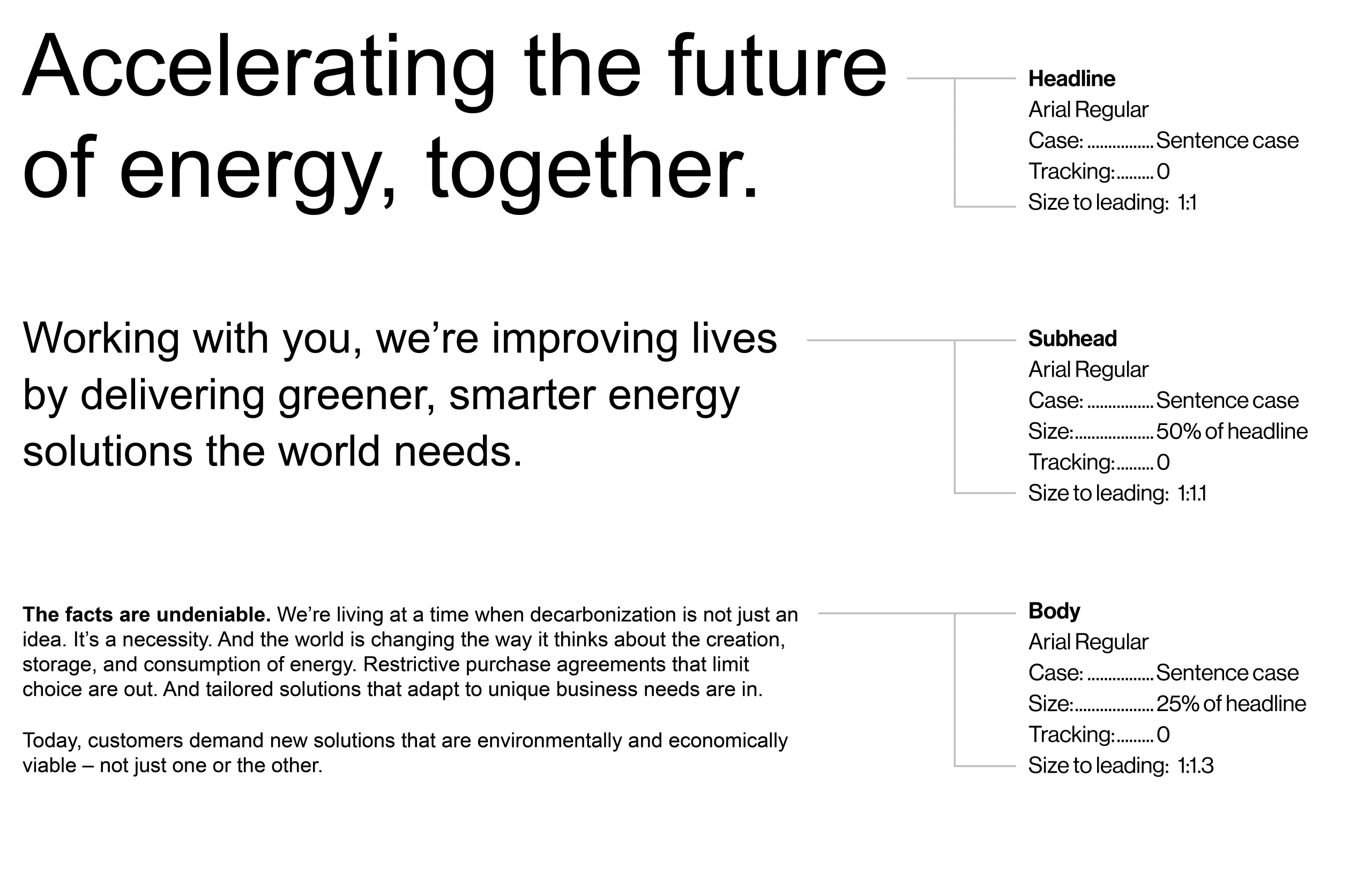
Arial
In situations where both the brand typeface and Helvetica are unavailable, all text is set in Arial Regular. Arial is used for internal applications like presentations, emails, and documents. For body copy, active call-outs are set in Bold.
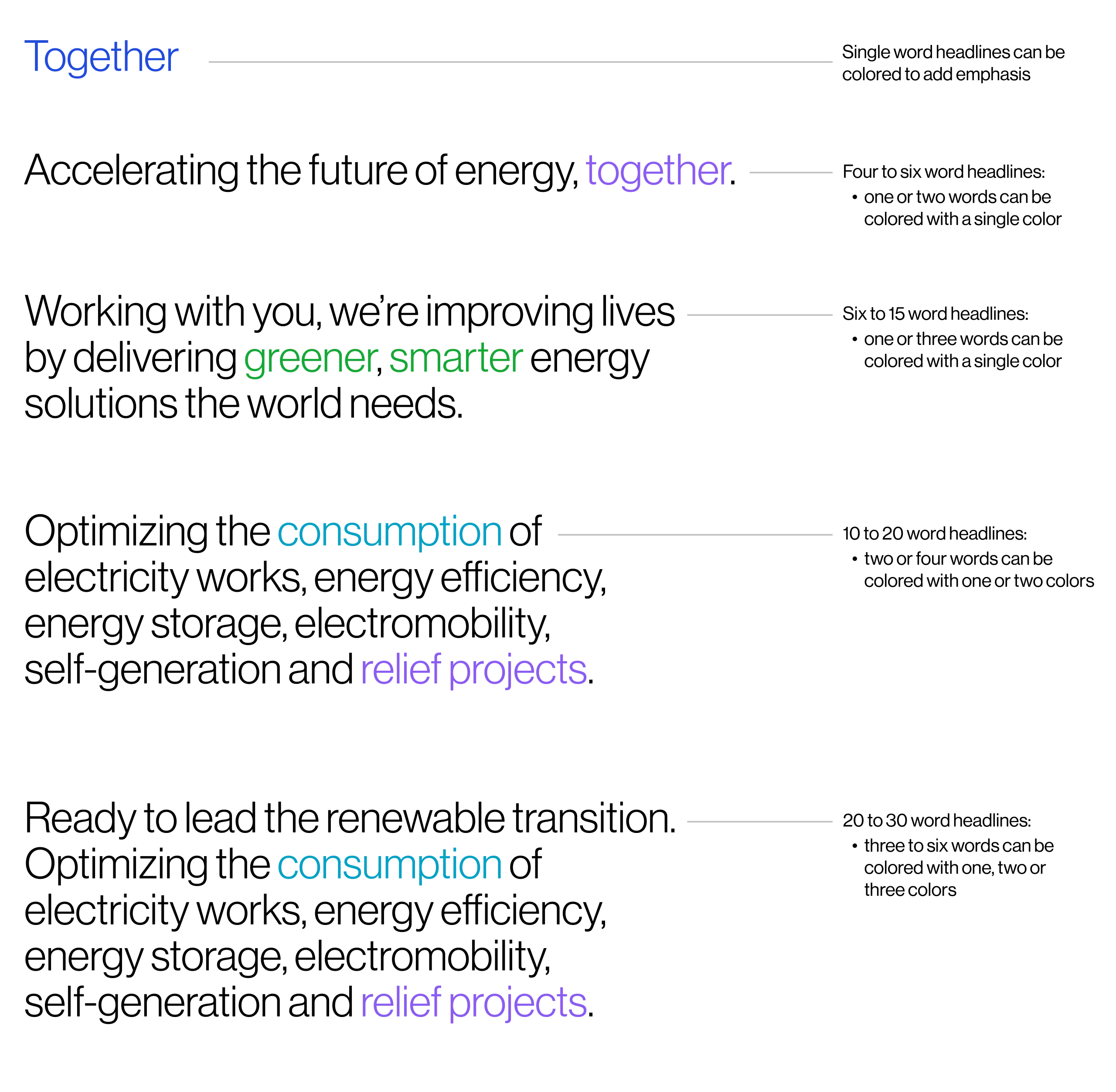
Color in type
Signature colors can be used to add specific emphasis to headlines:
AES Blue: opportunities
AES Purple: people
AES Aqua: technology
AES Green: impact
Refer to ‘Color breakdown’ page for signature color values.

AES Blue
Working with you, we're improving lives by delivering greener, smarter energy solutions the world needs.

AES Purple
Working with you, we're improving lives by delivering greener, smarter energy solutions the world needs.

AES Aqua
Working with you, we're improving lives by delivering greener, smarter energy solutions the world needs.

AES Green
Working with you, we're improving lives by delivering greener, smarter energy solutions the world needs.
Color examples
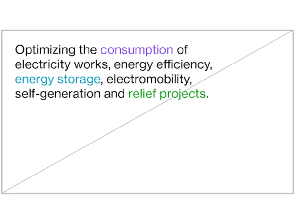
Please use this page as a guide on when—and how much—color to use within headlines.
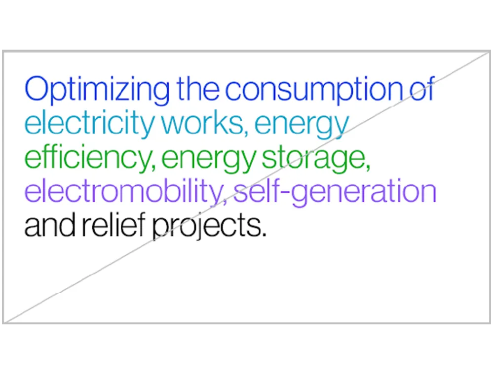
These color highlights should be used sparingly and not account for more than 25% of any given headline.
We recommend not coloring more than three consecutive words a single color and to restrict coloring consecutive words, multiple colors. Equally, look to avoid color highlights on adjacent lines.
Do not color punctuation such as periods, commas, asterisks or quotations.
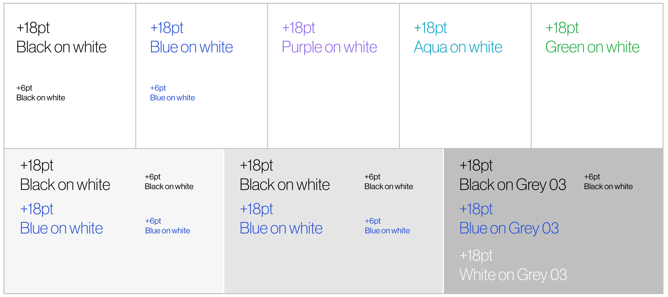
Type on Neutrals
We use the AES signature colors for typography and infographics. This AES color palette has been tested for legibility and ADA compliance. For best practice, please refer to this chart. Refer to ‘color breakdown’ page for color values.
ADA compliance:
All colors displayed fulfill ADA compliance guidelines when set at the typesizes mentioned.
Incorrect usage
Do not center, justify or right align type.
Do not use Neue Haas Display for body, or Neue Haas Text for headlines.
Do not color full lines of text. Do not color text on adjacent lines.
Do not use purple, aqua or green color type for copy smaller than 18pt. Text should not be smaller than 6pt.
Ensure text tone is consistent across typeface weights.
Only use Extra Light and Light weights from the Neue Haas family.
Do not use other typefaces.

Do not use mix typefaces. Do not use bold or tints to create active call-outs in headlines.
